library(stats)
library(DBI)
library(RPostgreSQL)
library(dplyr)
library(tidyr)
library(tsibble)
library(plotly)
library(TSstudio)
library(forecast)
library(ggplot2)
library(gridExtra)Campeonato Mundial de la Formula 1 (1950 - 2023)
Visualización Científica
La Fórmula 1, también conocida como F1, representa la cúspide de las carreras internacionales de monoplazas de ruedas abiertas, bajo la supervisión de la Federación Internacional del Automóvil (FIA). Desde su primera temporada en 1950, el Campeonato Mundial de Pilotos, rebautizado como el Campeonato Mundial de Fórmula 1 de la FIA en 1981, ha destacado como una de las principales competiciones a nivel global. La palabra “fórmula” en su nombre alude al conjunto de reglas que guían a todos los participantes en cuanto a la construcción y funcionamiento de los vehículos.
Definición
Una serie temporal es una realización parcial de un proceso estocástico de parámetro tiempo discreto, donde los elementos de \(I\) están ordenados y corresponden a instantes equidistantes del tiempo. Estos procesos estocásticos son colecciones o familias de variables aleatorias \(\{X_{t}\}_{t\in I}\) ordenadas según el subíndice \(t\) que en general se suele identificar con el tiempo. Llamamos trayectoria del proceso a una realización del proceso estocástico. Si \(I\) es discreto, el proceso es en tiempo discreto. Si \(I\) es continuo, el proceso es en tiempo continuo. Entre las series de tiempo, existen modelos estadísticos que definen el proceso de cualquier conjunto de hipótesis bien definidas sobre las propeidades estadísticas de dicho proceso estocástico.
Uno de los modelos más utilizados a la hora de realizar pronósticos de series de tiempo es el modelo ARIMA. Estos modelos ARIMA (Autorregresivos Integrados de Media Móvil) aproximan los valores futuros de una serie temporal como una función lineal de observaciones pasadas y términos de ruido blanco. Una serie de tiempo \(y_t\) se llama un proceso de media móvil integrada autorregresiva (ARIMA) de órdenes \(p, d, q\), denotado ARIMA(\(p, d, q\)) si su diferencia \(d\) da lugar a un proceso estacionario ARMA(\(p, q\)). Por lo tanto, un ARIMA(\(p, d, q\)) puede escribirse como
\[ \Phi(B)(1 - B)^{d} y_{t} = \delta + \Theta(B) \varepsilon_{t} \]
donde
\[ \Phi(B) = 1 - \sum_{i = 1}^{p} \phi_{i} B^{i} \quad \text{y} \quad \Theta(B) = 1 - \sum_{i = 1}^{q} \theta_{i} B^{i}, \]
son los términos del operador back-shit en los AR(\(p\)) y MA(\(q\)) definidos como \(\Phi(B) y_{t} = \delta + \varepsilon_{t}\) y \(y_{t} = \mu + \Theta(B) \varepsilon_{t}\) con \(\delta = \mu - \phi \mu\), donde \(\mu\) es la media y \(\varepsilon_{t}\) el ruido blanco con \(E(\varepsilon_t) = 0\) (Rubio 2024).
Planteamiento del problema
El análisis de series de tiempo SARIMA (Seasonal Autoregressive Integrated Moving Average) se propone como una herramienta efectiva para pronosticar la tasa de obtención de puntos de los cinco equipos más exitosos desde el año 2010. Estos equipos incluyen Red Bull Racing, Mercedes-AMG Petronas Formula One Team, Scuderia Ferrari, Williams Racing y McLaren F1 Team. El objetivo es generar pronósticos precisos para la tasa de obtención de puntos de estos equipos en los próximas 25 premios.
Obtención de los datos
Siguiendo el mismo enfoque utilizado en la sección anterior para llevar a cabo los análisis exploratorios, emplearemos una función para establecer la conexión con la base de datos.
Primero, importamos las bibliotecas necesarias:
A continuación, creamos la función que facilita las conexiones:
connection_db <- function(){
  return(connection <- dbConnect(
      RPostgres::Postgres(),
      dbname = 'f1_db',
                 host = 'ep-delicate-art-a5sxoon2.us-east-2.aws.neon.tech',
                 port = 5432,
                 user = 'f1_db_owner',
                 password = 'VOTP3ugh8Gts'
    )
  )
}
Es importante destacar que esta función utiliza una variable de entorno para almacenar los datos de conexión a la base de datos. En este caso, estamos utilizando Neon, que nos permite crear un servidor de bases de datos con PostgreSQL.
Como mencionamos previamente, las tablas y sus respectivas columnas que utilizaremos para el desarrollo de este modelo son las siguientes:
- Results: points (tasa de obtención de puntos).
- Races: date (fecha en que se celebró la carrera).
- Constructors: name (nombre del equipo).
Luego, ejecutamos la consulta SQL para obtener los datos relevantes:
connection <- connection_db()

query <- "
  SELECT
    r.date AS race_date,
    c.name AS team,
    SUM(res.points) AS points_sum,
    round((SUM(res.points) / COALESCE(fs.total_first_second, 1)) * 100, 4) AS adjusted_points_percentage
  FROM Results res
  JOIN Constructors c ON res.constructorId = c.constructorId
  JOIN Races r ON res.raceId = r.raceId
  LEFT JOIN (
    SELECT raceId, SUM(points) AS total_first_second
    FROM Results
    WHERE positionOrder IN (1, 2)
    GROUP BY raceId
  ) fs ON fs.raceId = res.raceId
  WHERE r.date >= '2010-01-01'
  GROUP BY r.date, c.name, fs.total_first_second
  ORDER BY r.date ASC, c.name ASC;
"
race_data <- dbGetQuery(connection, query)

dbDisconnect(connection)

race_ts_data <- race_data %>%
  filter(team %in% c("Ferrari", "Mercedes", "Red Bull", "McLaren", "Williams")) %>%
  select(race_date, team, adjusted_points_percentage) %>%
  spread(key = team, value = adjusted_points_percentage) %>%
  fill(Ferrari, .direction = "down") %>%
  fill(Mercedes, .direction = "down") %>%
  fill(`Red Bull`, .direction = "down") %>%
  fill(McLaren, .direction = "down") %>%
  fill(Williams, .direction = "down") %>%
  as_tsibble(index = race_date)

head(race_ts_data)
Con este procedimiento, hemos obtenido los datos necesarios para nuestro análisis y modelado subsiguiente.
Construcción del modelo SARIMA
El modelo ARIMA estacional (SARIMA), como su nombre lo indica, es una versión designada del modelo ARIMA para series temporales con una componente estacional. Una serie temporal con un componente estacional tiene una fuerte relación sus rezagos estacionales. El modelo SARIMA utiliza los rezagos estacionales de manera similar a como lo hace el modelo ARIMA, esto es, utiliza los rezagos no estacionales con los procesos AR y MA y la diferenciación. Para ello, añade los tres componentes siguientes al modelo ARIMA.
Proceso SAR (
P): Un procesoARestacional de la serie con susPrezagos estacionales pasados. Por ejemplo, unSAR(2)es un procesoARde la serie con sus dos últimos rezagos estacionales, es decir, \(Y_t = c + \Phi_1 Y_{t-f} + \Phi_2 Y_{t - 2f} + \varepsilon_{t}\) donde \(\Phi\) representa el coeficiente estacional del procesoSAR, y \(f\) representa la frecuencia de la serie.Proceso SMA (
Q): Un procesoMAestacional de la serie con sus Q términos de error estacionales pasados. Por ejemplo, unSMA(1)es un proceso de media móvil de la serie con su término de error estacional pasado, es decir, \(Y_t = \mu + \varepsilon_{t} + \Theta_1 \varepsilon_{t - f}\), donde \(\Theta\) representa el coeficiente estacional del procesoSMA.Proceso SI (
D): Una diferenciación estacional de la serie con sus últimosDrezagos estacionales. De forma similar, podemos diferenciar la serie con su rezago estacional, es decir, \(Y_{D = 1}' = Y_t - Y_{t - f}\).
Utilizamos la siguiente notación para denotar los parámetros SARIMA, donde los parámetros \(P\) y \(Q\) representan los ordenes correspondientes de los procesos AR y MA estacionales de la serie con sus rezagos estacionales, y \(D\) define el grado diferenciación de la serie con sus rezagos estacionales.
\[ \text{SARIMA}(p, d, q) \times (P, D, Q). \]
Visualización de las series de tiempo
Inicialmente, veamos gráficamente las series de tiempo que tenemos para cada equipo
Ferrari
m <- list(
    l = 0,
    r = 0,
    b = 0,
    t = 80
)

frecuencia <- 25

ferrari_ts <- ts(
    race_ts_data$Ferrari,
    frequency = frecuencia,
    start = c(
        as.integer(
            format(min(race_ts_data$race_date), "%Y")
        ),
        as.integer(format(min(race_ts_data$race_date), "%j"))
    )
)

fig <- ts_plot(
    ferrari_ts,
    title = "Rendimiento de Ferrari desde el 2013-Presente",
    Ytitle = "Porcentajes de puntos ganados",
    Xtitle = "Año",
    color = "#a6051a"
)

fig %>%
    layout(
        paper_bgcolor = "rgba(0, 0, 0, 0.0)",
        plot_bgcolor = "rgba(0, 0, 0, 0.0)",
        xaxis = list(gridcolor = "#111", showline = FALSE, color = 'white'),
        yaxis = list(title = "", gridcolor = "#111", showline = FALSE, showticklabels = F),
        showlegend = FALSE,
        font = list(color = "white"),
        margin = m
    )
Red Bull
redbull_ts <- ts(
    race_ts_data$`Red Bull`,
    frequency = frecuencia,
    start = c(
        as.integer(
            format(min(race_ts_data$race_date), "%Y")
        ),
        as.integer(format(min(race_ts_data$race_date), "%j"))
    )
)

fig <- ts_plot(
    redbull_ts,
    title = "Rendimiento de Red Bull desde el 2013-Presente",
    Ytitle = "Porcentajes de puntos ganados",
    Xtitle = "Año",
    color = "#223971"
)

fig %>%
    layout(
        paper_bgcolor = "rgba(0, 0, 0, 0.0)",
        plot_bgcolor = "rgba(0, 0, 0, 0.0)",
        xaxis = list(gridcolor = "#111", showline = FALSE, color = 'white'),
        yaxis = list(title = "", gridcolor = "#111", showline = FALSE, showticklabels = F),
        showlegend = FALSE,
        font = list(color = "white"),
        margin = m
    )
Mercedes
mercedes_ts <- ts(
    race_ts_data$Mercedes,
    frequency = frecuencia,
    start = c(
        as.integer(
            format(min(race_ts_data$race_date), "%Y")
        ),
        as.integer(format(min(race_ts_data$race_date), "%j"))
    )
)

fig <- ts_plot(
    mercedes_ts,
    title = "Rendimiento de Mercedes desde el 2013-Presente",
    Ytitle = "Porcentajes de puntos ganados",
    Xtitle = "Año",
    color = "#00a19c"
)

fig %>%
    layout(
        paper_bgcolor = "rgba(0, 0, 0, 0.0)",
        plot_bgcolor = "rgba(0, 0, 0, 0.0)",
        xaxis = list(gridcolor = "#111", showline = FALSE, color = 'white'),
        yaxis = list(title = "", gridcolor = "#111", showline = FALSE, showticklabels = F),
        showlegend = FALSE,
        font = list(color = "white"),
        margin = m
    )
Williams
williams_ts <- ts(
    race_ts_data$Williams,
    frequency = frecuencia,
    start = c(
        as.integer(
            format(min(race_ts_data$race_date), "%Y")
        ),
        as.integer(format(min(race_ts_data$race_date), "%j"))
    )
)

fig <- ts_plot(
    williams_ts,
    title = "Rendimiento de Williams desde el 2013-Presente",
    Ytitle = "Porcentajes de puntos ganados",
    Xtitle = "Año",
    color = "#00a3e0"
)

fig %>%
    layout(
        paper_bgcolor = "rgba(0, 0, 0, 0.0)",
        plot_bgcolor = "rgba(0, 0, 0, 0.0)",
        xaxis = list(gridcolor = "#111", showline = FALSE, color = 'white'),
        yaxis = list(title = "", gridcolor = "#111", showline = FALSE, showticklabels = F),
        showlegend = FALSE,
        font = list(color = "white"),
        margin = m
    )
McLaren
mclaren_ts <- ts(
    race_ts_data$McLaren,
    frequency = frecuencia,
    start = c(
        as.integer(
            format(min(race_ts_data$race_date), "%Y")
        ),
        as.integer(format(min(race_ts_data$race_date), "%j"))
    )
)

fig <- ts_plot(
    mclaren_ts,
    title = "Rendimiento de McLaren desde el 2013-Presente",
    Ytitle = "Porcentajes de puntos ganados",
    Xtitle = "Año",
    color = "#ff8000"
)

fig %>%
    layout(
        paper_bgcolor = "rgba(0, 0, 0, 0.0)",
        plot_bgcolor = "rgba(0, 0, 0, 0.0)",
        xaxis = list(gridcolor = "#111", showline = FALSE, color = 'white'),
        yaxis = list(title = "", gridcolor = "#111", showline = FALSE, showticklabels = F),
        showlegend = FALSE,
        font = list(color = "white"),
        margin = m
    )
Divisón de datos para entrenamiento del modelo
Ahora procederemos a definir nuestro conjunto de datos para entrenar el modelo. Donde, como mencionamos anteriormente, tomaremos como horizonte 25 premios.
ferrari_split <- ts_split(ferrari_ts, sample.out = 25)
redbull_split <- ts_split(redbull_ts, sample.out = 25)
williams_split <- ts_split(williams_ts, sample.out = 25)
mclaren_split <- ts_split(mclaren_ts, sample.out = 25)
mercedes_split <- ts_split(mercedes_ts, sample.out = 25)

ferrari_train <- ferrari_split$train
ferrari_test <- ferrari_split$test

redbull_train <- redbull_split$train
redbull_test <- redbull_split$test

williams_train <- williams_split$train
williams_test <- williams_split$test

mclaren_train <- mclaren_split$train
mclaren_test <- mclaren_split$test

mercedes_train <- mercedes_split$train
mercedes_test <- mercedes_split$test
Criterios AIC, BIC y HQIC
Los criterios de información de Akaike (AIC), Bayesiano (BIC) y de Hannan-Quinn (HQIC) utilizan el método de estimación de máxima verosimilitud (log-verosimilitud) de los modelos como medida de ajuste. Estas medidas buscan valores bajos para indicar un mejor ajuste del modelo a los datos, empleando las siguientes fórmulas:
\[ \begin{align*} \text{AIC} &= 2k - 2 \ln(L) \\ \text{BIC} &= k \ln(n) - 2 \ln(L) \\ \text{HQIC} &= 2k \ln(\ln(n)) - 2 \ln(L). \end{align*} \]
donde \(k\) representa el número de parámetros en el modelo estadístico, \(L\) el valor de la función de máxima verosimilitud del modelo estimado, y \(n\) el tamaño de la muestra.
Es importante destacar que, aunque aumentar el número de parámetros puede aumentar el valor de la verosimilitud, esto puede conducir a problemas de sobreajuste en el modelo. Para abordar este problema, los criterios mencionados anteriormente introducen un término de penalización basado en el número de parámetros. El término de penalización es mayor en el BIC que en el AIC para muestras superiores a 7. Por su parte, el HQIC busca equilibrar esta penalización, situándose entre el AIC y el BIC. La elección del criterio a utilizar dependerá del objetivo principal de la investigación.
En nuestra investigación, consideraremos el criterio de Akaike para identificar el mejor modelo. Comencemos creando una función que tome un dataframe de entrenamiento y devuelva el mejor conjunto de órdenes \(p, d, q\) y \(P, D, Q\) asociados al criterio AIC de bondad de ajuste, junto con el valor de AIC del mejor modelo encontrado para cada uno de los equipos.
best_ARIMA <- function(ts_in, p_n, d_n, q_n) {
    best_aic <- Inf
    best_pdq <- NULL
    best_PDQ <- NULL
    fit <- NULL
    for(p in 1:p_n) {
        for(d in 1:d_n) {
            for (q in 1:q_n) {
                for(P in 1:p_n) {
                    for(D in 1:d_n) {
                        for (Q in 1:q_n) {
                            tryCatch({
                                fit <- arima(
                                    scale(ts_in),
                                    order=c(p, d, q),
                                    seasonal = list(order = c(P, D, Q), period = 25),
                                    xreg=1:length(ts_in),
                                    method="CSS-ML"
                                )
                                tmp_aic <- AIC(fit)
                                if (tmp_aic < best_aic) {
                                    best_aic <- tmp_aic
                                    best_pdq = c(p, d, q)
                                    best_PDQ = c(P, D, Q)
                                }
                            }, error=function(e){})
                        }
                    }
                }
            }
        }
    }
    return(list("best_aic" = best_aic, "best_pdq" = best_pdq, "best_PDQ" = best_PDQ))
}
Procedemos a obtener los modelos:
if(file.exists("models/ferrari_best_arima.rda")) {
    ferrari_best_model = readRDS("models/ferrari_best_arima.rda")
} else {
    ferrari_best_model = best_ARIMA(ferrari_train, 3, 1, 3)
    saveRDS(best_model, file = "models/ferrari_best_arima.rda")
}

if(file.exists("models/redbull_best_arima.rda")) {
    redbull_best_model = readRDS("models/redbull_best_arima.rda")
} else {
    redbull_best_model = best_ARIMA(redbull_train, 3, 1, 3)
    saveRDS(best_model, file = "models/redbull_best_arima.rda")
}

if(file.exists("models/williams_best_arima.rda")) {
    williams_best_model = readRDS("models/williams_best_arima.rda")
} else {
    williams_best_model = best_ARIMA(williams_train, 3, 1, 3)
    saveRDS(best_model, file = "models/williams_best_arima.rda")
}

if(file.exists("models/mclaren_best_arima.rda")) {
    mclaren_best_model = readRDS("models/mclaren_best_arima.rda")
} else {
    mclaren_best_model = best_ARIMA(mclaren_train, 3, 1, 3)
    saveRDS(best_model, file = "models/mclaren_best_arima.rda")
}

if(file.exists("models/mercedes_best_arima.rda")) {
    mercedes_best_model = readRDS("models/mercedes_best_arima.rda")
} else {
    mercedes_best_model = best_ARIMA(mercedes_train, 3, 1, 3)
    saveRDS(best_model, file = "models/mercedes_best_arima.rda")
}
Best Ferrari model: SARIMA(2,1,3) (1,1,1) | Best AIC: 676.741028823375
Best Red Bull model: SARIMA(2,1,1) (1,1,2) | Best AIC: 658.138691622105
Best Mercedes model: SARIMA(2,1,3) (1,1,2) | Best AIC: 534.574235117408
Best Williams model: SARIMA(3,1,3) (1,1,1) | Best AIC: 535.393333012716
Best McLaren model: SARIMA(3,1,3) (1,1,1) | Best AIC: 578.999389008676Modelos ajustados
Luego de identificar los mejores ordenes para el modelo SARIMA, podemos pasar a identificar el mejor modelo ajustado teniendo en cuenta estos parámetros. Definamos una función para realizar hallar este modelo para cada uno de los equipos de interés.
fitted_model <- function(file, train, order_pdq, order_PDQ){
    fit_model <- NULL

    if(file.exists(file)) {
        fit_model = readRDS(file)
    } else {
        fit_model <- arima(
            train,
            order = order_pdq,
            seasonal = list(order = order_PDQ)
        )
        saveRDS(fit_model, file = file)
    }

    return(fit_model)
}
Ferrari
ferrari_fit_model <- fitted_model('models/ferrari_model.rda', ferrari_train, ferrari_best_model$best_pdq, ferrari_best_model$best_PDQ)
checkresiduals(ferrari_fit_model)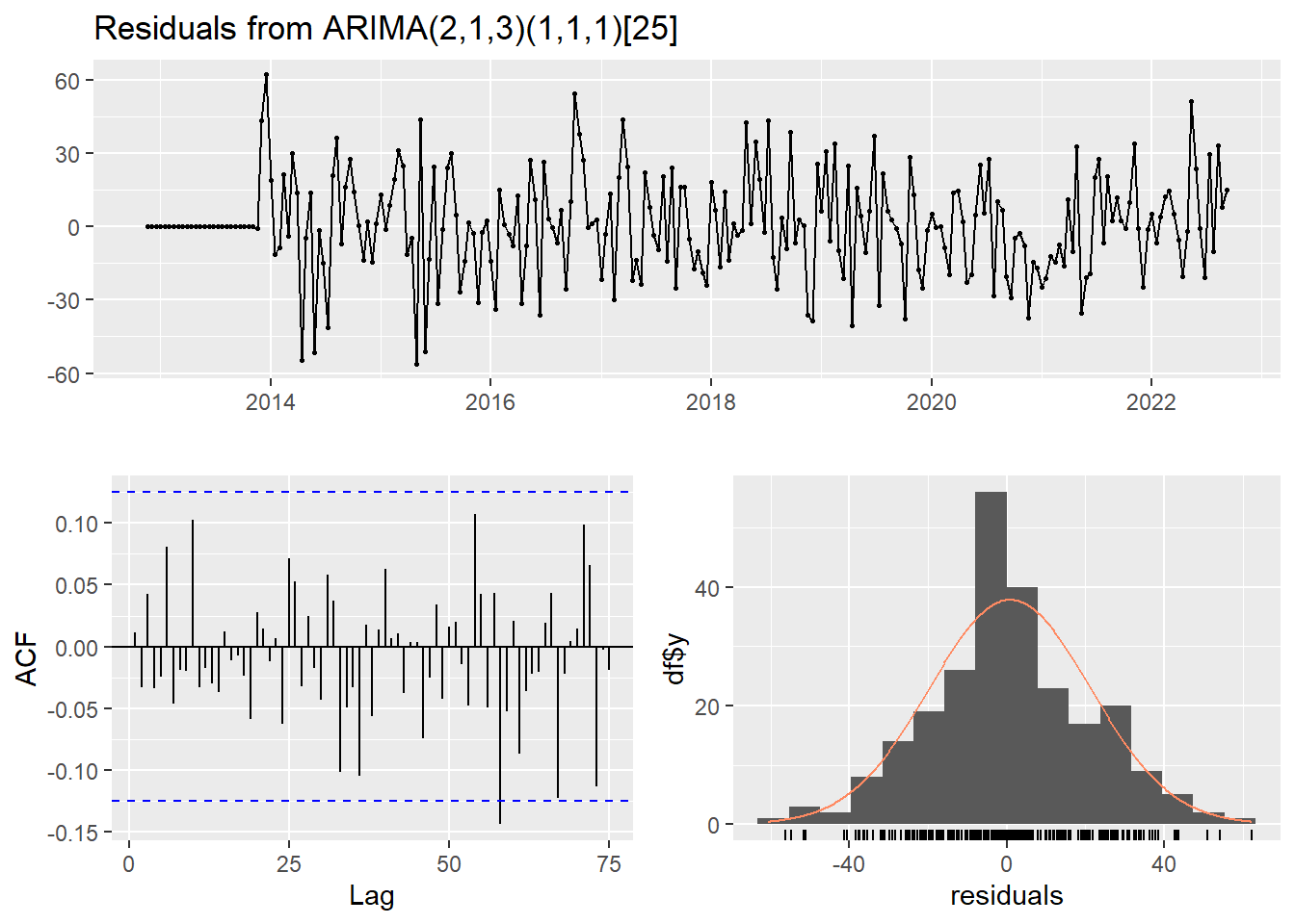
    Ljung-Box test

data:  Residuals from ARIMA(2,1,3)(1,1,1)[25]
Q* = 27.147, df = 42, p-value = 0.9632

Model df: 7.   Total lags used: 49
Forecasting sin rolling
ferrari_pred_25 <- forecast(ferrari_fit_model, h = 25)
ferrari_pred_25
Point Forecast Lo 80 Hi 80 Lo 95 Hi 95
2022.72 64.89216 36.114274 93.67005 20.88018134 108.90414
2022.76 67.48479 38.262048 96.70754 22.79246178 112.17712
2022.80 53.65407 24.024977 83.28317 8.34028008 98.96787
2022.84 49.80833 19.818323 79.79834 3.94257104 95.67409
2022.88 44.74469 14.514650 74.97472 -1.48816453 90.97754
2022.92 47.83882 17.298642 78.37900 1.13164716 94.54600
2022.96 49.14583 18.281043 80.01062 1.94221035 96.34945
2023.00 53.90034 22.678677 85.12201 6.15092535 101.64976
2023.04 60.23923 28.626499 91.85197 11.89172818 108.58674
2023.08 57.61234 25.590611 89.63406 8.63933396 106.58534
2023.12 54.51237 22.090746 86.93399 4.92777573 104.09696
2023.16 49.60666 16.817809 82.39551 -0.53955978 99.75288
2023.20 50.68929 17.574455 83.80413 0.04451918 101.33406
2023.24 39.47190 6.063613 72.88019 -11.62166826 90.56548
2023.28 50.37498 16.685517 84.06444 -1.14860546 101.89856
2023.32 53.57825 19.596778 87.55972 1.60807396 105.54843
2023.36 56.36384 22.062218 90.66547 3.90403566 108.82365
2023.40 58.63530 23.981531 93.28906 5.63693588 111.63366
2023.44 66.17163 31.146404 101.19686 12.60516804 119.73810
2023.48 54.61252 19.220226 90.00481 0.48467719 108.74036
2023.52 62.75652 27.023972 98.48906 8.10830618 117.40473
2023.56 44.69876 8.662669 80.73485 -10.41368503 99.81120
2023.60 41.04906 4.740166 77.35795 -14.48060191 96.57872
2023.64 55.15901 18.590676 91.72735 -0.76743125 111.08545
2023.68 43.04838 6.212865 79.88389 -13.28667728 99.38343fig <- plot_forecast(
ferrari_pred_25,
title = "Pronóstico últimas 25 carreras Ferrari",
Ytitle = "",
Xtitle = "Year",
color = "#a6051a"
)
fig %>%
layout(
paper_bgcolor = "rgba(0, 0, 0, 0.0)",
plot_bgcolor = "rgba(0, 0, 0, 0.0)",
xaxis = list(gridcolor = "#111", showline = FALSE, color = 'white'),
yaxis = list(title = "", gridcolor = "#111", showline = FALSE, showticklabels = F),
showlegend = FALSE,
font = list(color = "white"),
margin = m
)Rolling Forecasting
pred_rolling <- function(historico, prueba, modelo) {
    predicciones <- numeric(length(prueba))

    for (t in seq_along(prueba)) {
        modelo_ajustado <- Arima(historico, model=modelo)
        pronostico <- forecast(modelo_ajustado, h=1)
        predicciones[t] <- pronostico$mean

        if (predicciones[t]< 0) {
            predicciones[t] <- 0
        } else if (predicciones[t] > 100) {
            predicciones[t] <- 100
        }
        historico <- c(historico, prueba[t])
    }

    return(predicciones)
}

predicciones_ferrari <- pred_rolling(ferrari_train, ferrari_test, ferrari_fit_model)

df_entrenamiento <- data.frame(Fecha = time(ferrari_train), Valor = as.numeric(ferrari_train))
df_prueba <- data.frame(Fecha = time(ferrari_test), Valor = as.numeric(ferrari_test))
df_predicciones <- data.frame(Fecha = time(ferrari_test), Valor = predicciones_ferrari)

p_ferrari <- plot_ly() %>%
    add_lines(data = df_entrenamiento, x = ~Fecha, y = ~Valor, name = "Entrenamiento", line = list(color = '#a6051a')) %>%
    add_lines(data = df_prueba, x = ~Fecha, y = ~Valor, name = "Prueba", line = list(color = '#ffeb00')) %>%
    add_lines(data = df_predicciones, x = ~Fecha, y = ~Valor, name = "Predicción", line = list(color = '#fff')) %>%
    layout(
        title = paste("Predicción ARIMA Rolling -", 25, "premios"),
        xaxis = list(title = "Año", gridcolor = "#111", showline = FALSE, color = 'white'),
        yaxis = list(title = "", gridcolor = "#111", showline = FALSE, color = 'white'),
        showlegend = TRUE,
        paper_bgcolor = "rgba(0, 0, 0, 0.0)",
        plot_bgcolor = "rgba(0, 0, 0, 0.0)",
        font = list(color = "white"),
        margin = m
    )

p_ferrari
Red Bull
redbull_fit_model <- fitted_model('models/redbull_model.rda', redbull_train, redbull_best_model$best_pdq, redbull_best_model$best_PDQ)
checkresiduals(redbull_fit_model)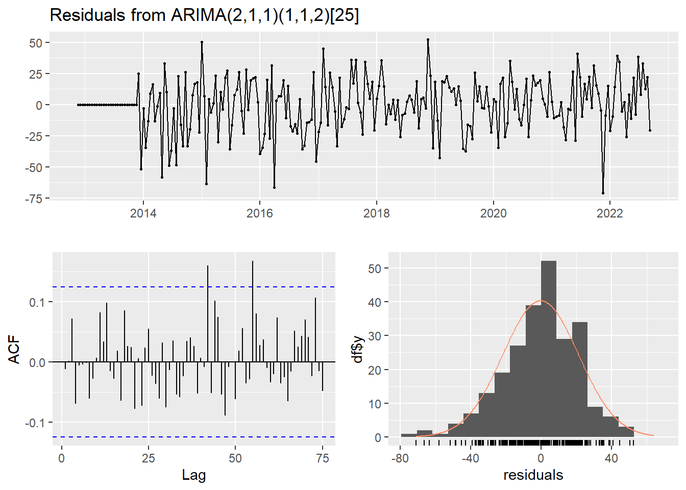
    Ljung-Box test

data:  Residuals from ARIMA(2,1,1)(1,1,2)[25]
Q* = 40.678, df = 43, p-value = 0.5725

Model df: 6.   Total lags used: 49
Forecasting sin rolling
redbull_pred_25 <- forecast(redbull_fit_model, h = 25)
redbull_pred_25
Point Forecast Lo 80 Hi 80 Lo 95 Hi 95
2022.72 77.23443 46.51130 107.95756 30.24746 124.2214
2022.76 68.37542 37.19930 99.55153 20.69566 116.0552
2022.80 66.86079 34.65631 99.06527 17.60829 116.1133
2022.84 79.30214 46.75327 111.85100 29.52294 129.0813
2022.88 81.19826 48.42753 113.96899 31.07976 131.3168
2022.92 81.64702 48.57870 114.71534 31.07339 132.2207
2022.96 79.87575 46.51245 113.23905 28.85098 130.9005
2023.00 67.90005 34.25252 101.54758 16.44059 119.3595
2023.04 78.88032 44.95140 112.80924 26.99051 130.7701
2023.08 83.06694 48.86008 117.27381 30.75206 135.3818
2023.12 66.20413 31.72169 100.68657 13.46778 118.9405
2023.16 67.31245 32.55678 102.06813 14.15823 120.4667
2023.20 82.90410 47.87735 117.93084 29.33531 136.4729
2023.24 83.79745 48.50174 119.09317 29.81731 137.7776
2023.28 68.72183 33.15919 104.28448 14.33346 123.1102
2023.32 68.55585 32.72826 104.38343 13.76229 123.3494
2023.36 84.75133 48.66075 120.84190 29.55556 139.9471
2023.40 71.23061 34.87895 107.58228 15.63554 126.8257
2023.44 76.90339 40.29250 113.51428 20.91187 132.8949
2023.48 73.62196 36.75367 110.49026 17.23677 130.0072
2023.52 82.89631 45.77239 120.02023 26.12018 139.6724
2023.56 76.83706 39.45925 114.21486 19.67264 134.0015
2023.60 83.41197 45.78200 121.04195 25.86189 140.9621
2023.64 85.13179 47.25125 123.01234 27.19850 143.0651
2023.68 76.65561 38.52614 114.78508 18.34162 134.9696fig <- plot_forecast(
redbull_pred_25,
title = "Pronóstico últimas 25 carreras Red Bull",
Ytitle = "",
Xtitle = "Year",
color = '#223971'
)
fig %>%
layout(
paper_bgcolor = "rgba(0, 0, 0, 0.0)",
plot_bgcolor = "rgba(0, 0, 0, 0.0)",
xaxis = list(gridcolor = "#111", showline = FALSE, color = 'white'),
yaxis = list(title = "", gridcolor = "#111", showline = FALSE, showticklabels = F),
showlegend = FALSE,
font = list(color = "white"),
margin = m
)Rolling Forecasting
predicciones_redbull <- pred_rolling(redbull_train, redbull_test, redbull_fit_model)

df_entrenamiento <- data.frame(Fecha = time(redbull_train), Valor = as.numeric(redbull_train))
df_prueba <- data.frame(Fecha = time(redbull_test), Valor = as.numeric(redbull_test))
df_predicciones <- data.frame(Fecha = time(redbull_test), Valor = predicciones_redbull)

p_redbull <- plot_ly() %>%
    add_lines(data = df_entrenamiento, x = ~Fecha, y = ~Valor, name = "Entrenamiento", line = list(color = '#223971')) %>%
    add_lines(data = df_prueba, x = ~Fecha, y = ~Valor, name = "Prueba", line = list(color = '#cc1e4a')) %>%
    add_lines(data = df_predicciones, x = ~Fecha, y = ~Valor, name = "Predicción", line = list(color = '#ffc906')) %>%
    layout(
        title = paste("Predicción ARIMA Rolling -", 25, "premios"),
        xaxis = list(title = "Año", gridcolor = "#111", showline = FALSE, color = 'white'),
        yaxis = list(title = "", gridcolor = "#111", showline = FALSE, color = 'white'),
        showlegend = TRUE,
        paper_bgcolor = "rgba(0, 0, 0, 0.0)",
        plot_bgcolor = "rgba(0, 0, 0, 0.0)",
        font = list(color = "white"),
        margin = m
    )

p_redbull
Mercedes
mercedes_fit_model <- fitted_model('models/mercedes_model.rda', mercedes_train, mercedes_best_model$best_pdq, mercedes_best_model$best_PDQ)
checkresiduals(mercedes_fit_model)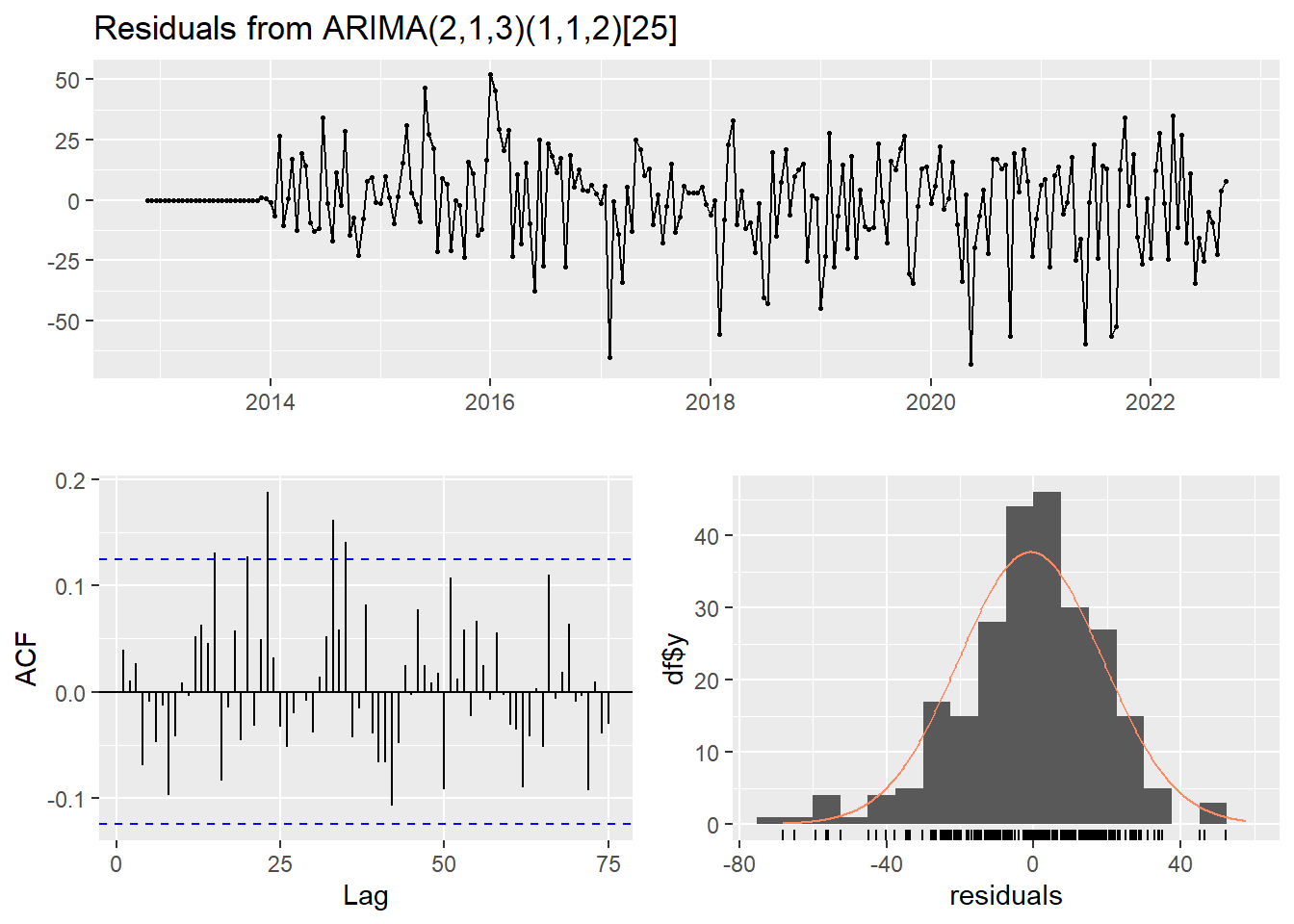
    Ljung-Box test

data:  Residuals from ARIMA(2,1,3)(1,1,2)[25]
Q* = 59.821, df = 41, p-value = 0.02894

Model df: 8.   Total lags used: 49
Forecasting sin rolling
mercedes_pred_25 <- forecast(mercedes_fit_model, h = 25)
mercedes_pred_25
Point Forecast Lo 80 Hi 80 Lo 95 Hi 95
2022.72 42.97671 14.040902 71.91252 -1.2767899 87.23021
2022.76 51.48153 22.437065 80.52599 7.0618545 95.90120
2022.80 55.52588 25.645174 85.40659 9.8272817 101.22448
2022.84 54.05646 23.484336 84.62859 7.3004296 100.81250
2022.88 52.19536 21.575777 82.81495 5.3667470 99.02398
2022.92 50.31769 19.134560 81.50083 2.6272060 98.00818
2022.96 60.71599 28.817430 92.61455 11.9313527 109.50063
2023.00 59.42068 27.300846 91.54051 10.2976339 108.54373
2023.04 66.59120 34.057730 99.12466 16.8355539 116.34684
2023.08 37.45663 4.251574 70.66169 -13.3261221 88.23939
2023.12 57.90353 24.404243 91.40282 6.6707922 109.13627
2023.16 60.31590 26.479356 94.15245 8.5673714 112.06443
2023.20 42.19866 7.766517 76.63080 -10.4607568 94.85807
2023.24 64.08325 29.295798 98.87070 10.8804353 117.28606
2023.28 53.43908 18.346405 88.53175 -0.2305343 107.10869
2023.32 52.93462 17.326162 88.54308 -1.5238188 107.39306
2023.36 29.74798 -6.255628 65.75159 -25.3147884 84.81075
2023.40 38.06940 1.767040 74.37176 -17.4502697 93.58907
2023.44 58.17589 21.426057 94.92572 1.9718724 114.37990
2023.48 46.24906 9.087175 83.41095 -10.5851412 103.08327
2023.52 40.24723 2.779780 77.71468 -17.0542912 97.54875
2023.56 65.08028 27.216784 102.94377 7.1730623 122.98749
2023.60 55.28715 17.013745 93.56055 -3.2469702 113.82126
2023.64 57.07778 18.487095 95.66846 -1.9415783 116.09713
2023.68 51.66780 12.715974 90.61962 -7.9038745 111.23947fig <- plot_forecast(
mercedes_pred_25,
title = "Pronóstico últimas 25 carreras Mercedes",
Ytitle = "",
Xtitle = "Year",
color = '#00a19c'
)
fig %>%
layout(
paper_bgcolor = "rgba(0, 0, 0, 0.0)",
plot_bgcolor = "rgba(0, 0, 0, 0.0)",
xaxis = list(gridcolor = "#111", showline = FALSE, color = 'white'),
yaxis = list(title = "", gridcolor = "#111", showline = FALSE, showticklabels = F),
showlegend = FALSE,
font = list(color = "white"),
margin = m
)Rolling Forecasting
predicciones_mercedes <- pred_rolling(mercedes_train, mercedes_test, mercedes_fit_model)

df_entrenamiento <- data.frame(Fecha = time(mercedes_train), Valor = as.numeric(mercedes_train))
df_prueba <- data.frame(Fecha = time(mercedes_test), Valor = as.numeric(mercedes_test))
df_predicciones <- data.frame(Fecha = time(mercedes_test), Valor = predicciones_mercedes)

p_mercedes <- plot_ly() %>%
    add_lines(data = df_entrenamiento, x = ~Fecha, y = ~Valor, name = "Entrenamiento", line = list(color = '#00a19c')) %>%
    add_lines(data = df_prueba, x = ~Fecha, y = ~Valor, name = "Prueba", line = list(color = '#80142b')) %>%
    add_lines(data = df_predicciones, x = ~Fecha, y = ~Valor, name = "Predicción", line = list(color = '#c6c6c6')) %>%
    layout(
        title = paste("Predicción ARIMA Rolling -", 25, "premios"),
        xaxis = list(title = "Año", gridcolor = "#111", showline = FALSE, color = 'white'),
        yaxis = list(title = "", gridcolor = "#111", showline = FALSE, color = 'white'),
        showlegend = TRUE,
        paper_bgcolor = "rgba(0, 0, 0, 0.0)",
        plot_bgcolor = "rgba(0, 0, 0, 0.0)",
        font = list(color = "white"),
        margin = m
    )

p_mercedes
Williams
williams_fit_model <- fitted_model('models/williams_model.rda', williams_train, williams_best_model$best_pdq, williams_best_model$best_PDQ)
checkresiduals(williams_fit_model)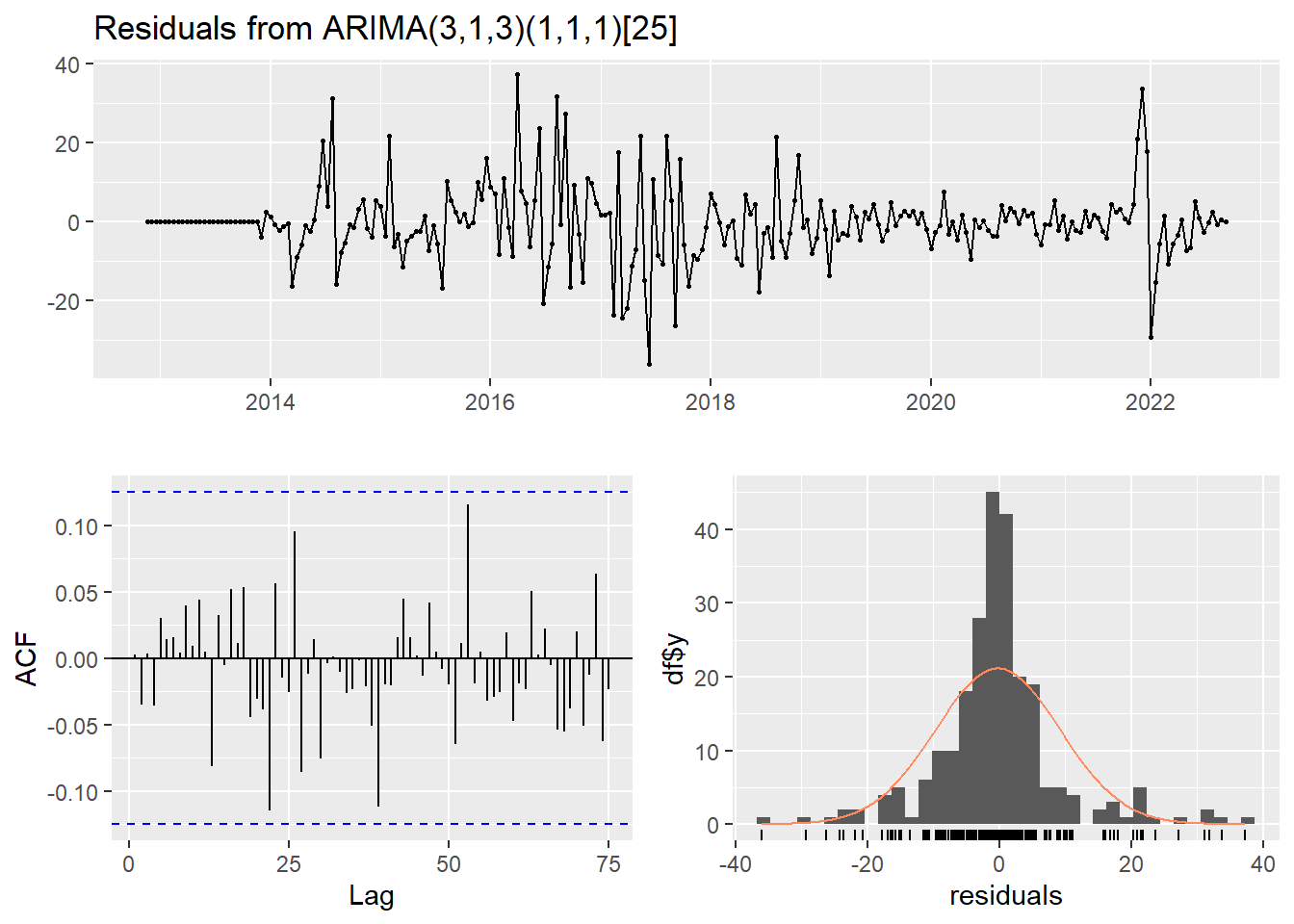
    Ljung-Box test

data:  Residuals from ARIMA(3,1,3)(1,1,1)[25]
Q* = 24.201, df = 41, p-value = 0.9829

Model df: 8.   Total lags used: 49
Forecasting sin rolling
williams_pred_25 <- forecast(williams_fit_model, h = 25)
williams_pred_25
Point Forecast Lo 80 Hi 80 Lo 95 Hi 95
2022.72 -2.92262198 -16.494597 10.64935 -23.67917 17.83392
2022.76 -1.66065607 -16.129885 12.80857 -23.78943 20.46812
2022.80 4.25142274 -11.204597 19.70744 -19.38652 27.88937
2022.84 0.10730987 -16.041396 16.25602 -24.59000 24.80462
2022.88 -1.02135177 -17.391565 15.34886 -26.05743 24.01473
2022.92 0.87879321 -15.812818 17.57040 -24.64882 26.40641
2022.96 7.39704629 -9.980915 24.77501 -19.18025 33.97434
2023.00 6.83030797 -11.080986 24.74160 -20.56265 34.22327
2023.04 2.11998645 -16.037032 20.27701 -25.64878 29.88875
2023.08 3.85567844 -14.633726 22.34508 -24.42143 32.13278
2023.12 -0.01034271 -19.077553 19.05687 -29.17112 29.15044
2023.16 2.86309429 -16.649794 22.37598 -26.97929 32.70548
2023.20 -0.95690395 -20.721597 18.80779 -31.18439 29.27059
2023.24 5.58340684 -14.515580 25.68239 -25.15534 36.32215
2023.28 4.62993092 -15.967528 25.22739 -26.87116 36.13103
2023.32 4.70479399 -16.280505 25.69009 -27.38945 36.79904
2023.36 4.49578553 -16.745647 25.73722 -27.99018 36.98175
2023.40 1.96002664 -19.611209 23.53126 -31.03033 34.95038
2023.44 5.27471400 -16.735345 27.28477 -28.38677 38.93619
2023.48 1.67422779 -20.683945 24.03240 -32.51965 35.86810
2023.52 1.09712036 -21.519391 23.71363 -33.49185 35.68609
2023.56 5.16411475 -17.773734 28.10196 -29.91630 40.24453
2023.60 8.07904394 -15.251975 31.41006 -27.60267 43.76076
2023.64 0.99622808 -22.654654 24.64711 -35.17467 37.16713
2023.68 0.91093394 -22.998385 24.82025 -35.65521 37.47708fig <- plot_forecast(
williams_pred_25,
title = "Pronóstico últimas 25 carreras Williams",
Ytitle = "",
Xtitle = "Year",
color = '#00a3e0'
)
fig %>%
layout(
paper_bgcolor = "rgba(0, 0, 0, 0.0)",
plot_bgcolor = "rgba(0, 0, 0, 0.0)",
xaxis = list(gridcolor = "#111", showline = FALSE, color = 'white'),
yaxis = list(title = "", gridcolor = "#111", showline = FALSE, showticklabels = F),
showlegend = FALSE,
font = list(color = "white"),
margin = m
)Rolling Forecasting
predicciones_williams <- pred_rolling(williams_train, williams_test, williams_fit_model)

df_entrenamiento <- data.frame(Fecha = time(williams_train), Valor = as.numeric(williams_train))
df_prueba <- data.frame(Fecha = time(williams_test), Valor = as.numeric(williams_test))
df_predicciones <- data.frame(Fecha = time(williams_test), Valor = predicciones_williams)

p_williams <- plot_ly() %>%
    add_lines(data = df_entrenamiento, x = ~Fecha, y = ~Valor, name = "Entrenamiento", line = list(color = '#00a3e0')) %>%
    add_lines(data = df_prueba, x = ~Fecha, y = ~Valor, name = "Prueba", line = list(color = '#e40046')) %>%
    add_lines(data = df_predicciones, x = ~Fecha, y = ~Valor, name = "Predicción", line = list(color = '#041e42')) %>%
    layout(
        title = paste("Predicción ARIMA Rolling -", 25, "premios"),
        xaxis = list(title = "Año", gridcolor = "#111", showline = FALSE, color = 'white'),
        yaxis = list(title = "", gridcolor = "#111", showline = FALSE, color = 'white'),
        showlegend = TRUE,
        paper_bgcolor = "rgba(0, 0, 0, 0.0)",
        plot_bgcolor = "rgba(0, 0, 0, 0.0)",
        font = list(color = "white"),
        margin = m
    )

p_williams
McLaren
mclaren_fit_model <- fitted_model('models/mclaren_model.rda', mclaren_train, mclaren_best_model$best_pdq, mclaren_best_model$best_PDQ)
checkresiduals(mclaren_fit_model)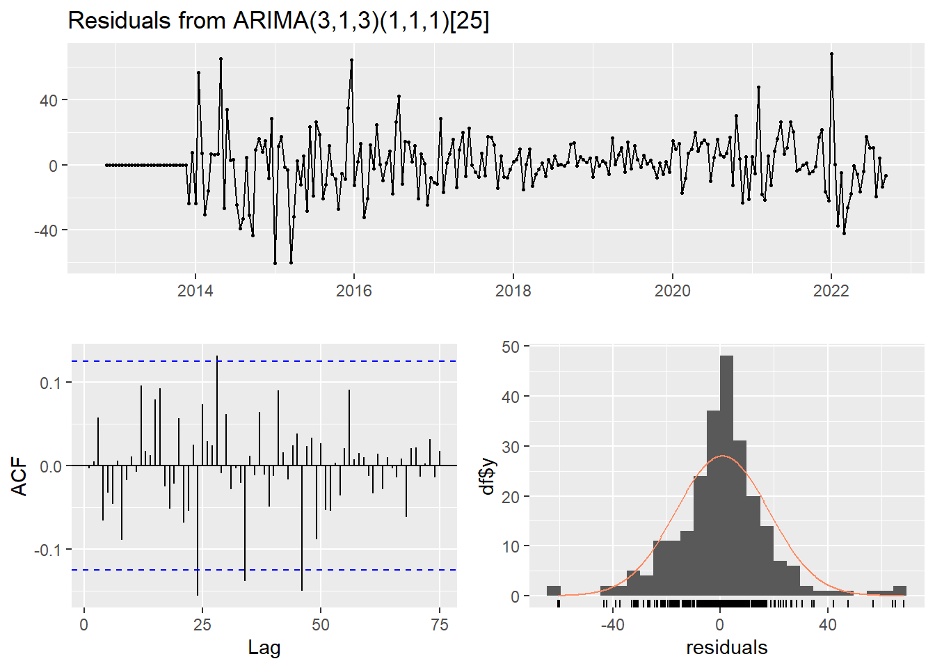
    Ljung-Box test

data:  Residuals from ARIMA(3,1,3)(1,1,1)[25]
Q* = 50.772, df = 41, p-value = 0.141

Model df: 8.   Total lags used: 49
Forecasting sin rolling
mclaren_pred_25 <- forecast(mclaren_fit_model, h = 25)
mclaren_pred_25
Point Forecast Lo 80 Hi 80 Lo 95 Hi 95
2022.72 27.29786 3.6223290 50.97340 -8.910742 63.50647
2022.76 23.64509 -0.6467697 47.93695 -13.506104 60.79628
2022.80 33.12711 8.5853564 57.66886 -4.406261 70.66047
2022.84 32.54800 7.9552240 57.14077 -5.063403 70.15940
2022.88 21.12748 -3.9615711 46.21653 -17.242912 59.49787
2022.92 22.41200 -2.6930942 47.51710 -15.982931 60.80694
2022.96 13.70429 -11.8348902 39.24348 -25.354518 52.76311
2023.00 34.16183 8.5404978 59.78317 -5.022618 73.34629
2023.04 26.75649 0.9551518 52.55784 -12.703254 66.21624
2023.08 22.37703 -3.6981238 48.45218 -17.501475 62.25553
2023.12 30.29711 4.1688176 56.42540 -9.662663 70.25688
2023.16 20.30576 -6.2131738 46.82468 -20.251447 60.86296
2023.20 18.70793 -7.8608388 45.27670 -21.925496 59.34136
2023.24 17.45056 -9.4028716 44.30400 -23.618222 58.51935
2023.28 18.26857 -8.7222396 45.25938 -23.010310 59.54745
2023.32 20.43566 -6.6844274 47.55574 -21.040934 61.91225
2023.36 17.93969 -9.4508444 45.33022 -23.950515 59.82989
2023.40 21.03588 -6.4211569 48.49291 -20.956032 63.02778
2023.44 24.78511 -2.9707030 52.54093 -17.663745 67.23397
2023.48 21.18122 -6.6615364 49.02399 -21.400604 63.76305
2023.52 24.27119 -3.7749784 52.31736 -18.621725 67.16411
2023.56 14.47817 -13.7378950 42.69424 -28.674578 57.63092
2023.60 20.32873 -7.9982275 48.65569 -22.993613 63.65107
2023.64 17.61866 -10.9545177 46.19184 -26.080245 61.31757
2023.68 18.00467 -10.6529797 46.66233 -25.823424 61.83277fig <- plot_forecast(
mclaren_pred_25,
title = "Pronóstico últimas 25 carreras McLaren",
Ytitle = "",
Xtitle = "Year",
color = '#ff8000'
)
fig %>%
layout(
paper_bgcolor = "rgba(0, 0, 0, 0.0)",
plot_bgcolor = "rgba(0, 0, 0, 0.0)",
xaxis = list(gridcolor = "#111", showline = FALSE, color = 'white'),
yaxis = list(title = "", gridcolor = "#111", showline = FALSE, showticklabels = F),
showlegend = FALSE,
font = list(color = "white"),
margin = m
)Rolling Forecasting
predicciones_mclaren <- pred_rolling(mclaren_train, mclaren_test, mclaren_fit_model)

df_entrenamiento <- data.frame(Fecha = time(mclaren_train), Valor = as.numeric(mclaren_train))
df_prueba <- data.frame(Fecha = time(mclaren_test), Valor = as.numeric(mclaren_test))
df_predicciones <- data.frame(Fecha = time(mclaren_test), Valor = predicciones_mclaren)

p_mclaren <- plot_ly() %>%
    add_lines(data = df_entrenamiento, x = ~Fecha, y = ~Valor, name = "Entrenamiento", line = list(color = '#ff8000')) %>%
    add_lines(data = df_prueba, x = ~Fecha, y = ~Valor, name = "Prueba", line = list(color = '#47c7fc')) %>%
    add_lines(data = df_predicciones, x = ~Fecha, y = ~Valor, name = "Predicción", line = list(color = '#fff')) %>%
    layout(
        title = paste("Predicción ARIMA Rolling -", 25, "premios"),
        xaxis = list(title = "Año", gridcolor = "#111", showline = FALSE, color = 'white'),
        yaxis = list(title = "", gridcolor = "#111", showline = FALSE, color = 'white'),
        showlegend = TRUE,
        paper_bgcolor = "rgba(0, 0, 0, 0.0)",
        plot_bgcolor = "rgba(0, 0, 0, 0.0)",
        font = list(color = "white"),
        margin = m
    )

p_mclaren
Correlación observación real v.s. predicha
create_correlation_plot <- function(actual, predicted, title, color1, color2) {
    data <- data.frame(Actual = actual, Predicted = predicted)
    p <- ggplot(data, aes(x = Actual, y = Predicted)) +
        geom_point(color = color1, alpha = 0.5) +
        geom_smooth(method = "lm", se = FALSE, color = color2) +
        xlab("Valores Reales") +
        ylab("Valores Predichos") +
        ggtitle(title) +
        theme_minimal()

    fig <- ggplotly(p)

    fig %>%
        layout(
            xaxis = list(gridcolor = "#111", showline = FALSE, color = 'white', tickfont = list(color = "white")),
            yaxis = list(gridcolor = "#111", showline = FALSE, color = 'white', tickfont = list(color = "white")),
            showlegend = TRUE,
            paper_bgcolor = "rgba(0, 0, 0, 0.0)",
            plot_bgcolor = "rgba(0, 0, 0, 0.0)",
            font = list(color = "white"),
            margin = m
        )
}
Ferrari
plot_rolling <- create_correlation_plot(ferrari_test, predicciones_ferrari, "Correlación Rolling Forecast - Ferrari", "#ffeb00", "#a6051a")
plot_forecast <- create_correlation_plot(ferrari_test, ferrari_pred_25$mean, "Correlación Direct Forecast - Ferrari", "#ffeb00", "#a6051a")

subplot <- subplot(plot_rolling, plot_forecast, nrows = 2, shareX = TRUE) %>%
    layout(
        hovermode = "x unified"
    )

annotations = list(
  list(
    x = 0.5,
    y = 1.0,
    text = "Correlación Rolling Forecast - Ferrari",
    xref = "paper",
    yref = "paper",
    xanchor = "center",
    yanchor = "bottom",
    showarrow = FALSE
  ),
  list(
    x = 0.5,
    y = 0.45,
    text = "Correlación Direct Forecast - Ferrari",
    xref = "paper",
    yref = "paper",
    xanchor = "center",
    yanchor = "bottom",
    showarrow = FALSE
  )
)

subplot <- subplot %>%layout(annotations = annotations)
subplot
Red Bull
plot_rolling <- create_correlation_plot(redbull_test, predicciones_redbull, "Correlación Rolling Forecast - Red Bull", "#cc1e4a", "#223971")
plot_forecast <- create_correlation_plot(redbull_test, redbull_pred_25$mean, "Correlación Direct Forecast - Red Bull", "#cc1e4a", "#223971")

subplot <- subplot(plot_rolling, plot_forecast, nrows = 2, shareX = TRUE) %>%
    layout(
        hovermode = "x unified"
    )

annotations = list(
  list(
    x = 0.5,
    y = 1.0,
    text = "Correlación Rolling Forecast - Red Bull",
    xref = "paper",
    yref = "paper",
    xanchor = "center",
    yanchor = "bottom",
    showarrow = FALSE
  ),
  list(
    x = 0.5,
    y = 0.45,
    text = "Correlación Direct Forecast - Red Bull",
    xref = "paper",
    yref = "paper",
    xanchor = "center",
    yanchor = "bottom",
    showarrow = FALSE
  )
)

subplot <- subplot %>%layout(annotations = annotations)
subplot
Mercedes
plot_rolling <- create_correlation_plot(mercedes_test, predicciones_mercedes, "Correlación Rolling Forecast - Mercedes", "#80142b", "#00a19c")
plot_forecast <- create_correlation_plot(mercedes_test, mercedes_pred_25$mean, "Correlación Direct Forecast - Mercedes", "#80142b", "#00a19c")

subplot <- subplot(plot_rolling, plot_forecast, nrows = 2, shareX = TRUE) %>%
    layout(
        hovermode = "x unified"
    )

annotations = list(
  list(
    x = 0.5,
    y = 1.0,
    text = "Correlación Rolling Forecast - Mercedes",
    xref = "paper",
    yref = "paper",
    xanchor = "center",
    yanchor = "bottom",
    showarrow = FALSE
  ),
  list(
    x = 0.5,
    y = 0.45,
    text = "Correlación Direct Forecast - Mercedes",
    xref = "paper",
    yref = "paper",
    xanchor = "center",
    yanchor = "bottom",
    showarrow = FALSE
  )
)

subplot <- subplot %>%layout(annotations = annotations)
subplot
Williams
plot_rolling <- create_correlation_plot(williams_test, predicciones_williams, "Correlación Rolling Forecast - Williams", "#e40046", "#00a3e0")
plot_forecast <- create_correlation_plot(williams_test, williams_pred_25$mean, "Correlación Direct Forecast - Williams", "#e40046", "#00a3e0")

subplot <- subplot(plot_rolling, plot_forecast, nrows = 2, shareX = TRUE) %>%
    layout(
        hovermode = "x unified"
    )

annotations = list(
  list(
    x = 0.5,
    y = 1.0,
    text = "Correlación Rolling Forecast - Williams",
    xref = "paper",
    yref = "paper",
    xanchor = "center",
    yanchor = "bottom",
    showarrow = FALSE
  ),
  list(
    x = 0.5,
    y = 0.45,
    text = "Correlación Direct Forecast - Williams",
    xref = "paper",
    yref = "paper",
    xanchor = "center",
    yanchor = "bottom",
    showarrow = FALSE
  )
)

subplot <- subplot %>%layout(annotations = annotations)
subplot
McLaren
plot_rolling <- create_correlation_plot(mclaren_test, predicciones_mclaren, "Correlación Rolling Forecast - McLaren", "#47c7fc", "#ff8000")
plot_forecast <- create_correlation_plot(mclaren_test, mclaren_pred_25$mean, "Correlación Direct Forecast - McLaren", "#47c7fc", "#ff8000")

subplot <- subplot(plot_rolling, plot_forecast, nrows = 2, shareX = TRUE) %>%
    layout(
        hovermode = "x unified"
    )

annotations = list(
  list(
    x = 0.5,
    y = 1.0,
    text = "Correlación Rolling Forecast - McLaren",
    xref = "paper",
    yref = "paper",
    xanchor = "center",
    yanchor = "bottom",
    showarrow = FALSE
  ),
  list(
    x = 0.5,
    y = 0.45,
    text = "Correlación Direct Forecast - McLaren",
    xref = "paper",
    yref = "paper",
    xanchor = "center",
    yanchor = "bottom",
    showarrow = FALSE
  )
)

subplot <- subplot %>%layout(annotations = annotations)
subplot
Evaluación de los modelos
forecast_accuracy <- function(forecast, actual, str_name) {
    epsilon <- 0.0001

    mape <- mean(abs(forecast - actual) / (abs(actual) + epsilon))

    mae <- mean(abs(forecast - actual))
    rmse <- sqrt(mean((forecast - actual)^2))
    mse <- mean((forecast - actual)^2)

    r_squared <- 1 - sum((actual - forecast)^2) / sum((actual - mean(actual))^2)

    df_acc <- data.frame(
        MAE = mae,
        MSE = mse,
        MAPE = mape,
        RMSE = rmse
    )

    rownames(df_acc) <- str_name

    return(df_acc)
}
Comencemos obteniendo las métricas para los modelo utilizando rolling:
ferrari_accuracy = forecast_accuracy(predicciones_ferrari, ferrari_test, 'Ferrari Rolling')
redbull_accuracy = forecast_accuracy(predicciones_redbull, redbull_test, 'Red Bull Rolling')
mercedes_accuracy = forecast_accuracy(predicciones_mercedes, mercedes_test, 'Mercedes Rolling')
williams_accuracy = forecast_accuracy(predicciones_williams, williams_test, 'Williams Rolling')
mclaren_accuracy = forecast_accuracy(predicciones_mclaren, mclaren_test, 'McLaren Rolling')
Ahora, obtendremos las métricas para lo modelos sin utilizar rolling:
ferrari_accuracy_nor = forecast_accuracy(ferrari_pred_25$mean, ferrari_test, 'Ferrari sin Rolling')
redbull_accuracy_nor = forecast_accuracy(redbull_pred_25$mean, redbull_test, 'Red Bull sin Rolling')
mercedes_accuracy_nor = forecast_accuracy(mercedes_pred_25$mean, mercedes_test, 'Mercedes sin Rolling')
williams_accuracy_nor = forecast_accuracy(williams_pred_25$mean, williams_test, 'Williams sin Rolling')
mclaren_accuracy_nor = forecast_accuracy(mclaren_pred_25$mean, mclaren_test, 'McLaren sin Rolling')

accuracy <- rbind(ferrari_accuracy, redbull_accuracy, mercedes_accuracy, williams_accuracy, mclaren_accuracy,
                  ferrari_accuracy_nor, redbull_accuracy_nor, mercedes_accuracy_nor, williams_accuracy_nor, mclaren_accuracy_nor)

accuracy
En general, para cada equipo, los valores de MAE, MSE, MAPE y RMSE son más bajos cuando se utiliza el rolling, lo que indica un mejor rendimiento en la predicción.
Referencias
Rubio, Lihki. 2024. «Predicciones de series de tiempo con Python». 2024. https://lihkir.github.io/DataVizPythonRUninorte/predictive_model.html.